
Vector to Stitch File
Thu, 05 Aug 2021
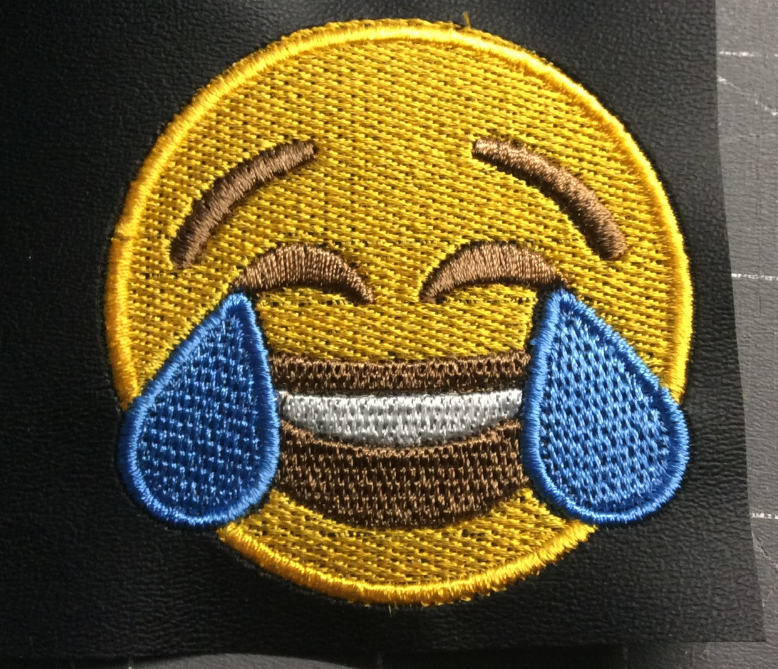
Now that we have a vector, what happens if we export it to an embroidery file?
It’s actually not bad! But the “circle” is now about 2 3/8″ wide while still being 2.5″ tall. By default, the solid shapes are filled with horizontal tatami stitch. Looks fine on the screen, but every stitch pulls its bit of the fabric together just a smidge, even on something ultra-stable like marine vinyl. There’s a vertical underlay, but it’s much less dense than the fill stitch which means if you stitch a solid circle, it will end up oval: a little shorter than the screen version, and a lot narrower. Stitch it on a less-stable fabric like a sweatshirt and it gets a lot worse.
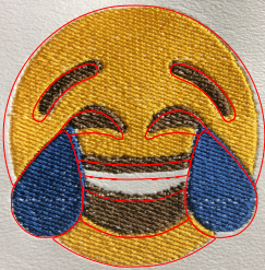
But this isn’t a solid circle, so each individual shape also pulls away from each other. You can’t really see because the red lines cover it up, but there’s the hint of a gap on the inside lower edge of each eyebrow – the yellow circle pulled inward, but then the embroidery machine returns to where the eyebrow should be to fill it in. Sometimes this happens within a color: this eye has a solid fill and a satin outline, and the minky pulled just enough to leave some white fibers showing in the gap.
Of course, you need to have your stabilizer drum-taut in the hoop, and have your fabric securely tacked down (be it hooped with the stabilizer; or floated on it and taped, pinned, basted, or spray-adhesived in place). But there comes a point when if the fabric can’t pull, it will tear itself apart. So your design has to allow for a little pull.
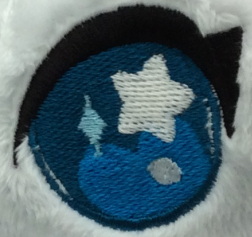
One way to cut down on distortion is to not have an entire design that’s horizontal fill – go into the params for different shapes and change the angle of their fill. This also mixes up the texture a little for contrast, and sometimes makes the fills match their shapes better – the highlight on that eye has a fill that aligns with the “shoulders” of the star, for instance.
I’m going to change the mouth fill to be vertical, and add a fill for the teeth because I may not always want to stitch it on white ground. And I’ll make the blue fill align with the direction of the tears.
Ink/Stitch also has built-in pull compensation. For fills, that just increases the size of the filled shape a smidge. It’s kind of like Inkscape’s Path > Outset, but it is a thing that happens at stitch file time. That means you can resize your design as much as you want, and the pull compensation will always be the same size. You may want to set it to a different pull compensation for different fabrics, as well.
I’m going to give the inner shapes a 0.2mm pull compensation, just so they don’t make gaps.
There’s not much we can do about the giant yellow forehead though, and any pull compensation is going to increase the height as well. So I’ll brute-force it: I’ll stretch the design horizontally by an eighth of an inch or so. But I’ll do that at the end.

Adding Satins
Even if I’m not making a patch, a satin border makes things look a lot cleaner. And tiny, linear shapes look better in satin than fill as well, so I’m going to change the eyes and eyebrows to satin.
I’ll start out by changing it from a fill to an outlined shape. Satin stitches like this are the biggest way Ink/Stitch SVGs diverge from plain ones to the naked eye.
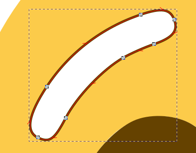
I’ll break it at each end (satin needs two rails to bounce back and forth between), and add some rungs to indicate the direction of the stitches.
I’ll also give it some pull compensation. Satin pull means each stitch overshoots by a little bit. Long satin stitches pull more than shorter ones, so we’ll see how it goes.
I’m going to do the same thing to the other eyebrow and both eyes, and then start a border satin. A 3mm solid line will make a zigzag stitch, though it defaults to the same density as a satin so generally it’s the same thing. If it was a plain circle I could just leave it like this (albeit in the right color), but I want to skip over the teardrops.

I’ll break the circle, then Convert Line to Satin. Then I’ll clean up the angles of the ends.

Then I’ll duplicate a teardrop, change it to an outline, duplicate it again and Inset it enough to make the inner rail. Then I’ll add some rungs.

Once the satins are properly colored, and I made sure things are stacked in the right order, it looks pretty good. If I was really ambitious I’d probably put a yellow satin around the mouth as well, but not today.

At this point it probably looks good enough to stitch out, though there’s still some fine-tuning for a more professional result. Doing a little inset on the teardrop fills will reduce the stitch count without changing the appearance. The same is true of the border of the yellow, but first I want to see what the pull makes that look like.

Time for a trial run.
Pretty good! I accidentally cleared the params on the teardrops though. This is why you should always run a Simulator on it first. There’s a little gapping by the tears under each eye, so I’ll extend that stitching a little. Any overkill will be covered by the teardrop satin stitching.
The eye and eyebrow pull compensation is inadequate at 0.2mm so I’ll bump it up to 0.5mm, which is probably still a little conservative.
There’s a lot of white speckling in the fills which is a chronic problem with white vinyl. I could try to fix it by increasing the fill density, but that will make the pull worse and possibly lead to some waviness in the vinyl or even some tear-on-the-dotted-line trouble, so I’m going to ignore it for purposes of this tutorial. In a real-world situation my first choice would be to choose a different ground; there’s something about pure white vinyl, probably chemical, that means it’s “puffier” than other colors. Some people fix it by coloring the white bits with Sharpie (usually only effective on black thread), by tweezering the protruding bits out, or by using a ball-point needle to gently shove the bits back under the stitching. I usually fix it by switching to neoprene, or duck, or felt.
The satin has also improved the roundedness of the shape, so I’m not going to mess with the proportions further. Time for a final stitch-out.

On this one I somehow failed to overwrite the old stitch file, and I didn’t notice until the yellow was done (and only noticed then because the order of brown and white were still reversed, a mistake I’d corrected). So the under-eye gap is still there, though it’s less prominent on the black vinyl, and it’s fixed in the final file.
This is JoAnn’s “blackboard fabric,” a vinyl with a very firm, matte surface. It’s a tiny bit grabby, sometimes leading to surface looping, but otherwise it’s great for working with. You can see a little waviness to it, but that’s because I floated it with nothing to hold it down, and stitched a dense design right on its edge. I’m going to call it done.
[Tears of Joy (4×4 Friendly, ZIP)]
This is copyrighted by Silver Seams in the year noted in its URL, and licensed under Creative Commons’ [CC-BY-SA](https://creativecommons.org/licenses/by-sa/4.0/). This basically means you’re free to sell items you make from it, provided you give reasonable attribution, and that if you modify it you’re required to share your changes with the world under the same license (the actual legal bits are in the link).