Digitizing outlined graphics
Tue, 25 Oct 2022
The commonest question on embroidery software forums has got to be "I digitized this, why does it look bad?" The answer boils down to: turning chunky line art into embroidery is harder than it seems.
There's a phase we all go through, of "this is a simple design, I can just embroider it myself!" leading to the harsh reality of just how much work a design can take. Some really are simple, and you'll pretty quickly get a feel for what kind of commitment a design is going to take.
More importantly, even if you never digitize a design yourself, looking through the process will tell you what to look for in a "boughten" design, and help you spot bad digitization without having to buy and stitch it out.
This assumes you've read my basic Ink/Stitch digitizing tutorial, which covers turning bitmaps into vectors, and vectors into something digitizable. This is mostly about the specifics of a common type of design: one with solid fills and a heavy outline.
Converting the outlines
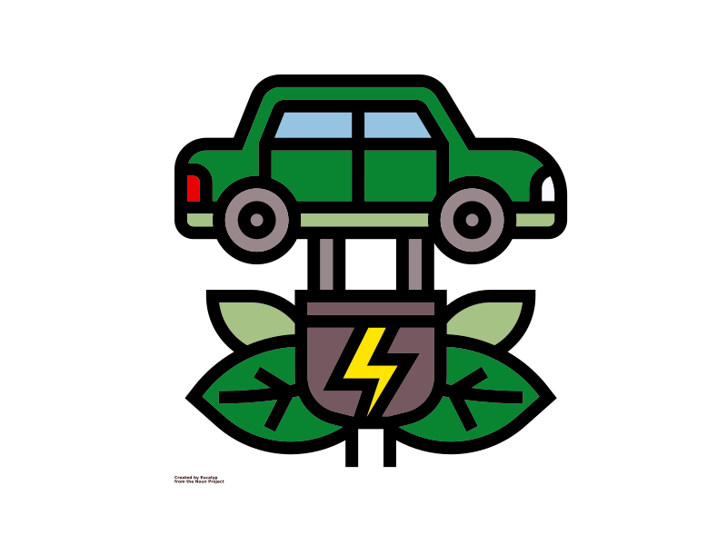
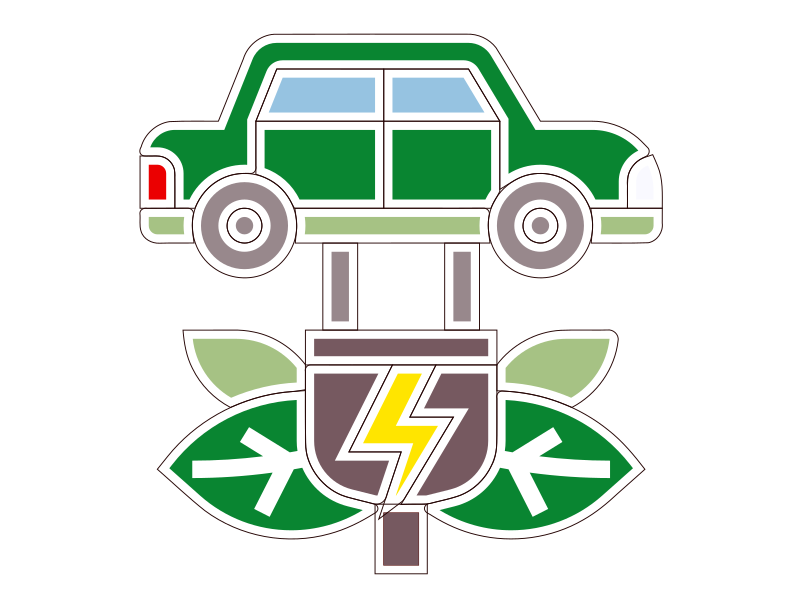
While the featured image (renewable energy by Eucalyp from Noun Project, with some additional colorization) looks like it should embroider out beautifully, it will need a lot of work first. As is, the pulls on each color block will leave gaps between everything, and the black outline will look a lot rougher in thread. Like, a lot rougher.
There are a lot of designs on Etsy and such that are just SVGs run through an embroidery program. If lines don't look like they're satin-stitch, run away from that seller quickly. I don't even buy from anywhere that doesn't show a physical, non-simulated stitch-out, and I definitely don't sell anything I haven't tested myself - I rarely even offer them as freebies.
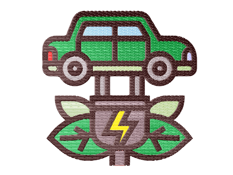
Even assuming you have a pristine vector, you can't just go straight to embroidery. It looks pretty good in the simulator, but as you learned in the digitizing tutorial, that doesn't translate directly to the real world. I added satins in that graphic, but that was just color-blocks. Theoretically in a large enough stitch-out I could do that here - just duplicate the black layer, take out the fill, add a stroke border, convert it to satin, and clean up any odd corners. But that would be a pretty giant graphic, just walls of solid fill.
At this scale, those black lines themselves should be 2mm satins. Now, if I had the artist's real vector source, before all the lines were flattened down into solid fills, it would probably be easier. Instead I will have to "decompile" this into that source. (More on that in a moment...)
There are a few ways to do that.
Manually breaking down the outlines
I touched on this in the Monogramming without a font mini-tutorial, and filled it out more in Satin joins and corners. It's just taking the node editor, finding the two "rails" of a satin line, and breaking them out into their own object, over and over and over again. It's tedious, you have to fix all the intersections by hand (a whole as-yet-unwritten tutorial there!), but once you have a little practice at making the right choices it yields a very accurately-digitized result. It's what I've used to make alphabets like Bluenesia.
This is pretty much the method you have to use when your lines vary in thickness.
Centerline tracing
Inkscape has centerline tracing, but it ironically makes you turn your vector into a bitmap. With just the black layer visible, go into File > Export PNG and export your selection at a pretty high resolution (I used 2000x2000ish). Reopen the resulting PNG in Inkscape and select Path > Trace Bitmap. Change the trace method (usually defaults to Brightness Cutoff) to Centerline Tracing (autotrace) and play with the settings until you get the best result.
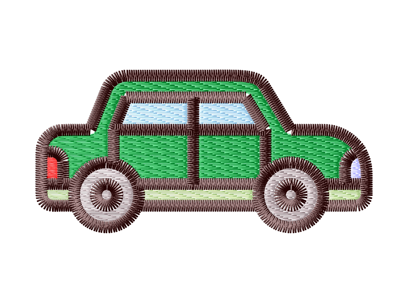
This will give you a basic, usually 1px line tracing of the outline. Changing that to a 1.8mm solid line and rendering it shows a decent start, at least. The algorithm made some interesting choices about which line to follow at intersections, and breaking those and instead joining the "through" line (e.g. along the bottom of the doors, and around the wheels) will improve the smoothness. There always seems to be at least one point, often along the edge of an image, where the algo just gives up and doesn't draw the line, like around the taillights. But this was a very clean, geometric graphic so it did a pretty good job.
Once the solid line is cleaned up, choosing Extension > Ink/Stitch > Tools: Satin > Convert Line to Satin will change the solid line (a zigzag stitch) to a full-fledged satin (a Z-stitch with options for things like an underlying contour stitch, which can make the edge much smoother. It will also manage corners a little better, with appropriate adjustments to the rungs to help it along.
Fill expansion
This gets a little nerdy, but bear with me. If you discard the black outline shape altogether, you can expand the fills to (usually) find the centerline between them.
Duplicating all the fill shapes and converting the duplicate to unfilled objects with a black stroke outline gets us this.
I drew a line between two corners of the doors and checked its length, so I know the satin will be 1.9340mm wide. If you go into Edit > Preferences > Behavior > Steps and put 1.9340/4 into the box for Inset/outset by, you can do two outsets and get the center line. (Yes, you can put arithmetic into almost any box that takes a number. Try it, it's handy!)
With all the black-outline versions of the fills selected, a Path > Outset twice results in black lines meeting mostly in the middle. The sides of the leaf veins met and vanished, but dialing back the inset number a tiny bit will fix that, or just recreate those manually. Some of the corners lost a little clarity - dividing the steps by eight or even sixteen and doing more outset steps will cut down on that somewhat, but for simple geometric shapes two steps is enough.
All the interior lines are doubled, so the less-accurate segment in each pair must be deleted, and then the same Convert Line to Satin cleanup as the centerline method.
Manually redrawing the outlines
Sometimes just starting from scratch is the only way to get it right. This isn't usually true for the entire image, but for geometric shapes like circles and straight lines, it's usually best to replace the traced version.
This is how the artist drew this design in the first place - if you're looking for vector art that's easier to digitize, find (or commission) some that still has the original shapes. Now, if you were wanting a shape that was suitable for a cutting machine, you'd do some Path > Stroke to Path and Path > Union to get one big happy shape, the way this SVG started out, but that's not what we want for embroidery.
Cleaning up
Regardless of how you got here, there will always be a little more cleanup to do. Aside from converting these zigzags to satins, there's some re-ordering to be done. Again, this is nothing a computer can really guess at - it won't know the horizontal should go over the vertical in the door/window four corners, or that the outermost line goes on top of the car body pieces, with the tires on top of that. You'll want to do as much routing minimization as you can by hand, because when you auto-route your satins you will need to do it with the stitch order preserved.
You'll also want to change your fill-stitch angles up, both to spread out the pull and also for aesthetic purposes - align the small leaves' fills with their angle, change the cord/plug to vertical. The tire fills might look interesting with a circular fill - Extension > Ink/Stitch > Params and changing the Auto fill to Contour fill might make things interesting.
You'll also want to add some pull compensation in your fills with the Expand box in Params. Contour fills don't (currently, at least) have any pull compensation, so if you find you need a little extra there you'll want to use the Path > Outset (or Dynamic Outset) to bulk up your fill manually. Save an original version of the shape in a hidden layer in case you want to revert to it. Depending on your design you may also want to add a fractional millimeter to the Pull Compensation on the satins as well, though be careful that doesn't bloat the line shapes too much.
Still more cleanup
All these previews have displayed with jump stitches turned off, so that's another consideration: if your machine doesn't auto-trim, you may want to re-order your fills. Ink/Stitch is pretty good about minimizing the jumps between neighboring fills and the satins will cover most of those, but you'll still need to make sure the ordering is good for that.
That's a good question to ask before buying a design: what does it look like with intact jump stitches? An inexperienced digitizer might not have considered what a machine without auto-trim, or that doesn't honor mid-color trims in the design, will do with their design. A good digitizer will make sure that no untrimmed jumps are trapped by later stitching within the color, or likely to snag on the foot as it repositions. Nothing like having the foot grab the piece and rip it off the stabilizer with only one color to go!
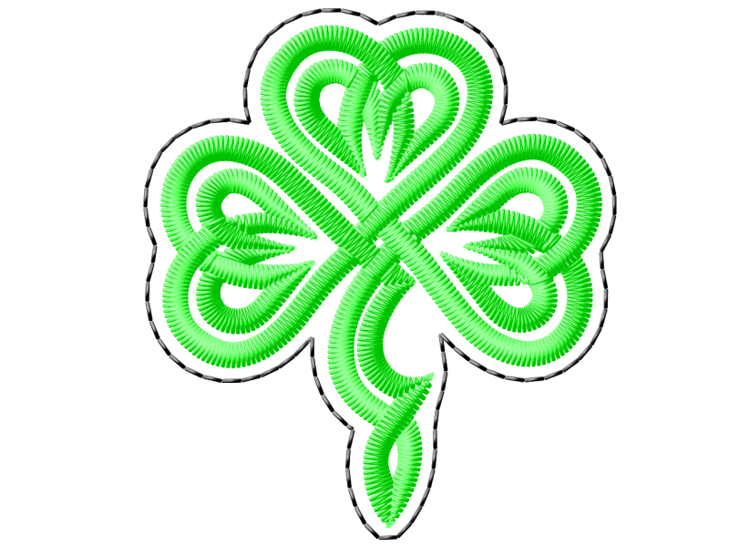
I kind of glossed over the construction of satin joins and corners here, because that's another whole tutorial. I'll just leave the Shamrock and its very sharp corners here to give you an idea of what needs to be done sometimes.