
Chunky lettering with contour fill
Mon, 29 Aug 2022
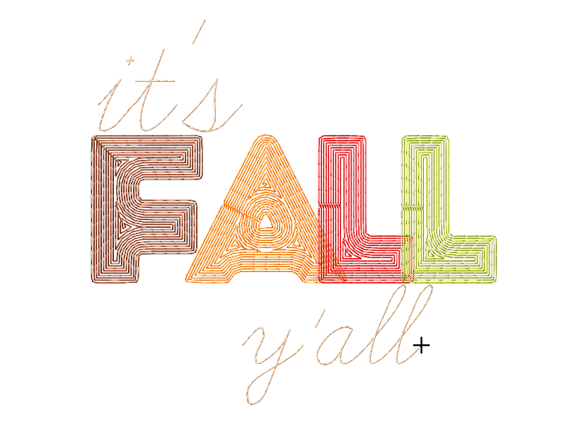
Let me preface this by saying: it's not actually fall yet, y'all, but the DIY calendar has to run at least a little ahead of the actual one.
Anyway.
I needed a chunky font, and none of Ink/Stitch's built-ins were quite it. I wanted a nice overlapping, not-too-dense-stitching font. Really, I wanted WhoopAss.
Most computer fonts don't convert instantly to embroidery. But some do, sort of. Getting WhoopAss' overlapping kerning correct would be more than I had time for right now, so why not just use the TrueType kerning?
It went like this:
I put it in Inkscape, using the computer font and Inkscape's (not Ink/Stitch's)
Textfunctions.I hit
Path > Object to Path(actuallyshift-ctrl-C) to convert it to shapes, and ungrouped it (ctrl-G) so I had four shapes.I changed the colors, which is optional.
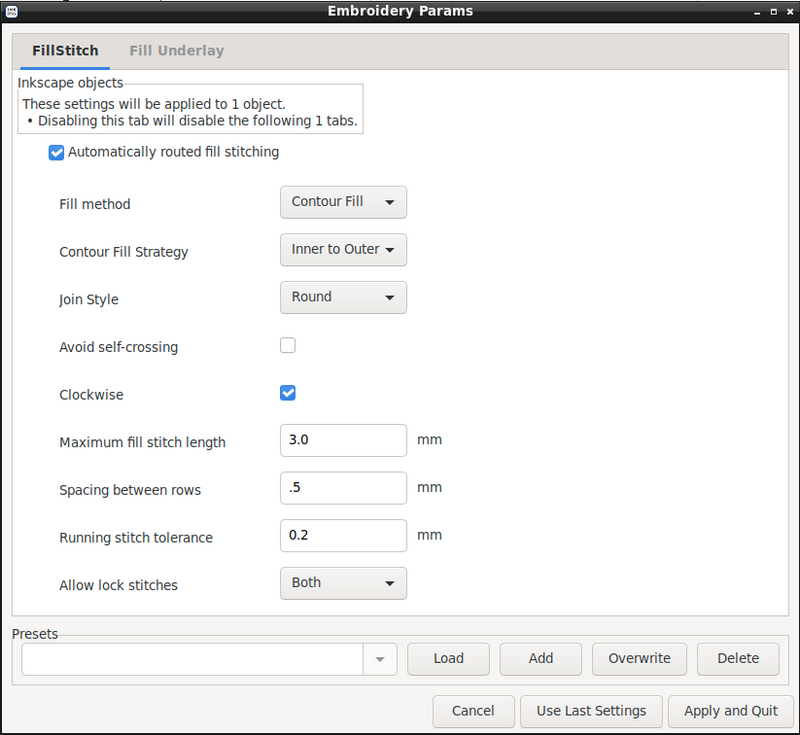
I gave it a Contour fill. That's the fun part.
I lightened up the fill density and, though you can't see it on that dialog, turned off the underlay. You can play around with the different fill choices, though Inner to Outer seems to be least likely to get weirdly confused in odd shapes like letters. (The algorithm is a work in progress, and the next release should be even better about finding its path.)
That's it! I added the rest of the lettering with Ink/Stitch's lettering (LearningCurve, to be specific), and now I am ready for fall.
Comments are not available.
