Fonts usually require a lot of by-hand digitization, but not always. If you poke around on Etsy or weird random embroidery websites, you will find plenty of low-effort "digitized" designs (almost entirely unlicensed IP). Someone has taken a vector, or made a vector from a bitmap image, and run it through a digitization program to apply generic, zero-degree tatami fills. The results are always terrible, doubly so when they've done it with a font.
But if you select your font very carefully, and you're not afraid to do a little tweaking if you need to, you can do lettering in Ink/Stitch without the built-in Lettering. The secret is the contour fill. Convert your words from Inkscape font object to a filled path: Path > Object to Path or Shift+Control+C. Give them a contour fill, and see how it looks.
Rounded fonts work better
Fonts that already have some casual rounding tend to look a little better with contours - the fill isn't going to make precise right angles, so it's better not to have them.
Larger counters work better
Intersections and other areas are going to have some gaps, especially if you leave out the underlay. You want to have a big difference between the counters (the spaces inside letters) and those gaps. Erica Type's "a" and "e" both turn somewhat blobby, at least at this scale. That's the bold version, so the regular version might have been a better choice.
Sometimes counters confuse the algorithm, especially where there's more than one, and it can't figure out a path that will properly fill a shape. Changing the size or density sometimes helps, and other times you just have to break up the shape.
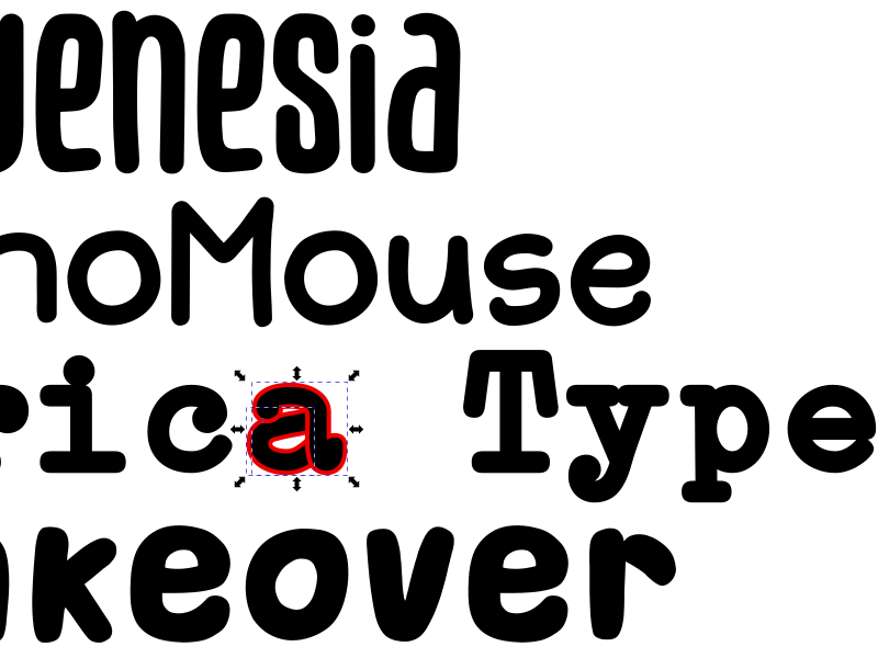
Monoweight fonts work better
With a satin font, the width of the lines changes the width of the stitch. With a contour font, a change in width will leave a gap, until the gap gets wide enough to admit a new thread run. Where the thread run can't get all the way through a narrow passage, it'll make a V, with a triangular gap past the point. Having a monoweight line, where nearly every area has the same number of thread runs, looks much cleaner.
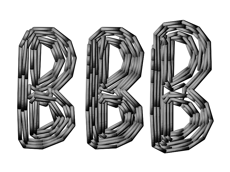
Sometimes you'll have to adjust the letters to cut down the gapping. The Bluenesia example has a narrow gap down the center of the letters, which might be a neat effect stitched out, but probably is just going to show the underlay grid if there is one. There are two ways to fix that: change the density of the contour lines, or make the letters large enough that another stitch run fits naturally. The middle B has .22mm spacing instead of .25mm, and the righthand B is 33pt rather than 30pt.
Contour isn't perfect
The tatami/brick fill algorithm is designed to break up lines formed by the ends of stitches; contour can develop some interesting, odd, or distracting patterns in those, especially at intersections. Lean into the informality: consider using no underlay, and doubling (or for larger letters, tripling) the spacing for a looser fill.
Contour can also help on larger letters - tatami might look smoothest, but it has a very directional pull. If the pattern developing doesn't bother you, larger latters filled with contour and outlined with a narrow satin can hold their shape even on knits.