Banner vinyl

Today in “Karen puts wacky stuff in her embroidery machine…”: Sign vinyl!
I mean, it doesn’t sound that wacky… vinyl is vinyl, right? Wellllll…
Marine and promo vinyls are composite fabric: a loose woven fabric backing with a somewhat spongy, thick PVC or polyurethane (PU) coating. Marine vinyls are very thick, and are (in theory, anyway) more UV-stable; promos tend to be thinner but still a little squishy.
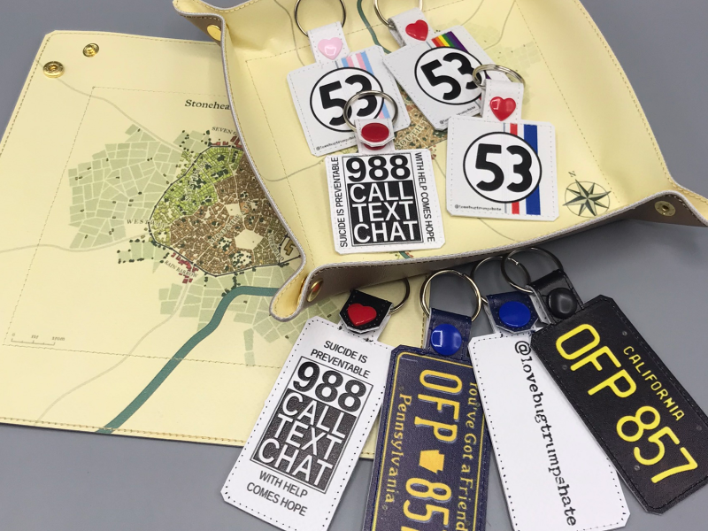
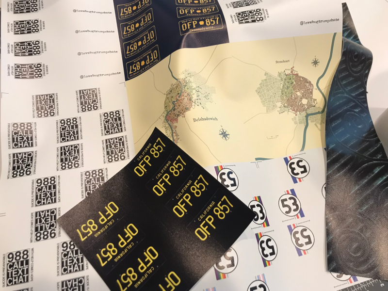
Sign vinyl doesn’t have the backing, and are instead very dense PVC. The one I chose was heavy-duty 18oz vinyl, the same weight as most marines, but it’s very thin and, in the fob sizes, downright rigid. I ordered a 2’ x 3’ banner, which gave me enough space for twelve 8” squares - the size of the large Janome hoop. A less impulsive person would have taken a picture of the whole banner, but I immediately wanted to know how hard it was to rotary-cut. Answer: not very, even with the dull retired-to-stabilizer-cutting-duty blade.

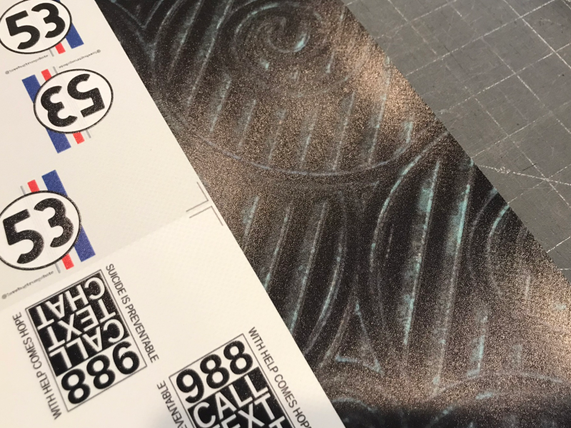
I have no idea what the sign shop thought of my weird design choices. Herbie and D&D, a very normal mix. The 3” length left me a 4” strip along the short side, so I grabbed a CC-licensed texture to see how it handled darker colors. The contrast remains decent (unlike Spoonflower that quickly devolves into black, black, and black) even though it has a tendency to make dark colors darker than the screen - the Pennsylvania blue plate came out a little darker than I’d hoped. This kind of thing is normal: converting RGB to CMYK is an inexact process, so you want to print a color chart and trust that versus what it looks like on the screen.

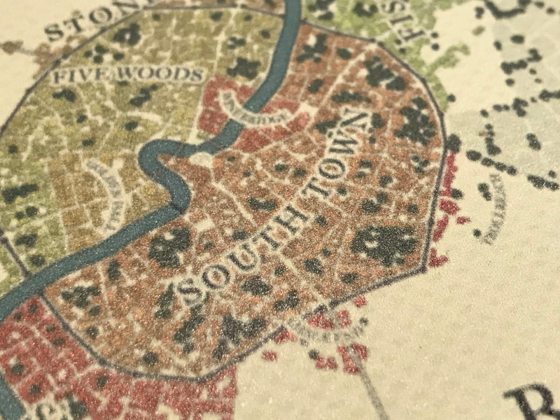
Because it’s expected to be for signage, not closeups, I wasn’t sure what the resolution was going to end up being. It’s not bad at all. Their software (or printer firmware) does some anti-aliasing, I think, so that might not be a universal thing. The black-and-white text is fairly sharp, so maybe it was my file.
The vinyl has a texture, but it’s fairly understated. I actually expected ridges, which I think the 13oz vinyl has. It’s supposed to be a matte coating but it still has a fair amount of gloss (the ink itself, I think), which makes photography a little more difficult but is fine in person.

The 200mm Janome hoop field is a smidge smaller than 8”, so I printed registration marks in the corners of each square, which match up to a stitched tackdown. The tackdown starts in the corner, so I can position the first corner, manually drop the needle to make sure it’s going to strike exactly on that corner, and stitch the tackdown. It stops between each corner, so I can shift the vinyl to make sure it’s straight and tack down the second corner, and after that the third and fourth will generally be exact. I trim the back to the registration marks, then tape it to the back of the hoop within the stitched marks, and generally everything comes out fairly exact.
(Yes, I forgot the registration layer on the license-plate squares. Always double-check your work before sending it in!)
I wasn’t sure if the machine was going to have trouble with the dense vinyl, but it was fine with a regular 75 universal needle and normal embroidery speed. After the first sheet, I dialed the top tension up one mark and had no trouble with it dragging in the hoop or anything; it was very well-behaved, no thread breaks.
There was one dealbreaker for this shop, and that’s why I’m not naming them: they shipped via Uline. Shipping also cost nearly as much as the (admittedly very cheap) banner so I wanted to find a local shop already, but that sealed the deal.
Some shops will apparently run JoAnn marine vinyl in their printers, according to a sign-shop-owner forum I perused, so my next step will be finding a local one that is as willing to put experimental stuff in their printers as I am in my embroidery machine computer-controlled sewing machine.
(Want the finished fobs, and/or to help Gabe and Herbie on their suicide-prevention mission, or just want to read the backstory behind these fobs? Visit the secret Love Bug section of the shop. )
