Monogramming without a font
Or rather, without an embroidery font. You don’t need to buy a whole font if you just need initials or a name. You can just create it in Inkscape.
If you want to digitize starting from a bitmap, there’s a more detailed tutorial here. If you want more detail on satin joins and corners, I have a tutorial on, well, satin joins and corners.
Note: Mr. Baskerville, who taught me typesetting, is currently turning over in his grave at my use of “font” when what I really mean is “font file,” “alphabet,” “typeface,” etc. but I’m sorry, I’m just going to use “font” to cover the whole range of meanings here.
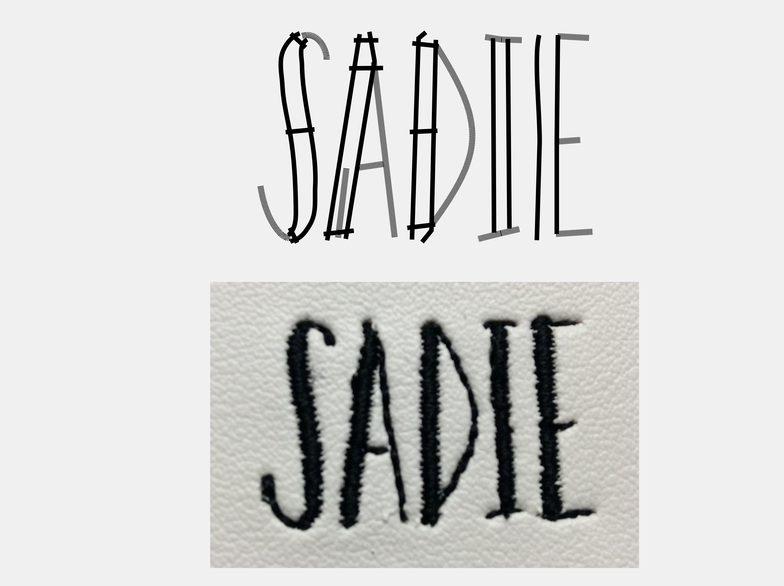
To do that, you need the letters in SVG form. There are a few ways to do that: get a TrueType or similar font; trace a bitmap; or freehand it yourself directly in Inkscape. I’m going to show the first method, with a font named Sadie Sans. It’s a little (a lot!) picture-heavy, because I’m going to assume you know nothing about Inkscape, much less Ink/Stitch.
First of all, you want to pick a suitable font. At 15mm tall (a little over half an inch), Sadie’s wide lines are around 1.5mm, which is a little narrow for vinyl embroidery. But good news! Since we’re building this from scratch, we have control over pull compensation. The narrow lines will need to be running stitch. If you buy this font from a random Etsy seller, chances are it’s an auto-conversion and those narrow lines are going to be around 0.35mm. Your typical embroidery machine needle is 0.80mm. Good luck sewing a coherent satin stitch half the width of your needle! I’ll be mixing satin and running stitches to show how it’s done.
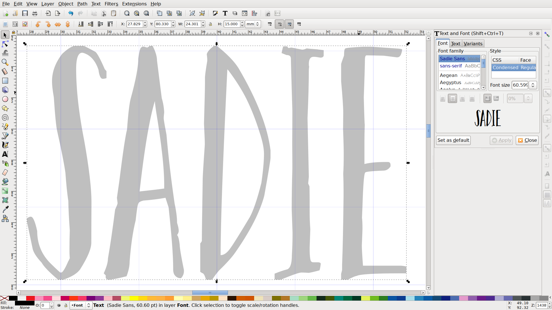
Here’s the word I’m digitizing, set to 15mm. The font version is in a locked layer so it will always be underneath what I’m doing, as a point of reference. I have a copy in my working layer, which I will:
- convert to an object (Path > Object to Path / Ctrl-Shift-C)
- ungroup (Object > Ungroup / Ctrl-Shift-G)
- add outline (right click on a color swatch, Set Stroke)
- remove fill (right click on a color swatch, Set Fill)
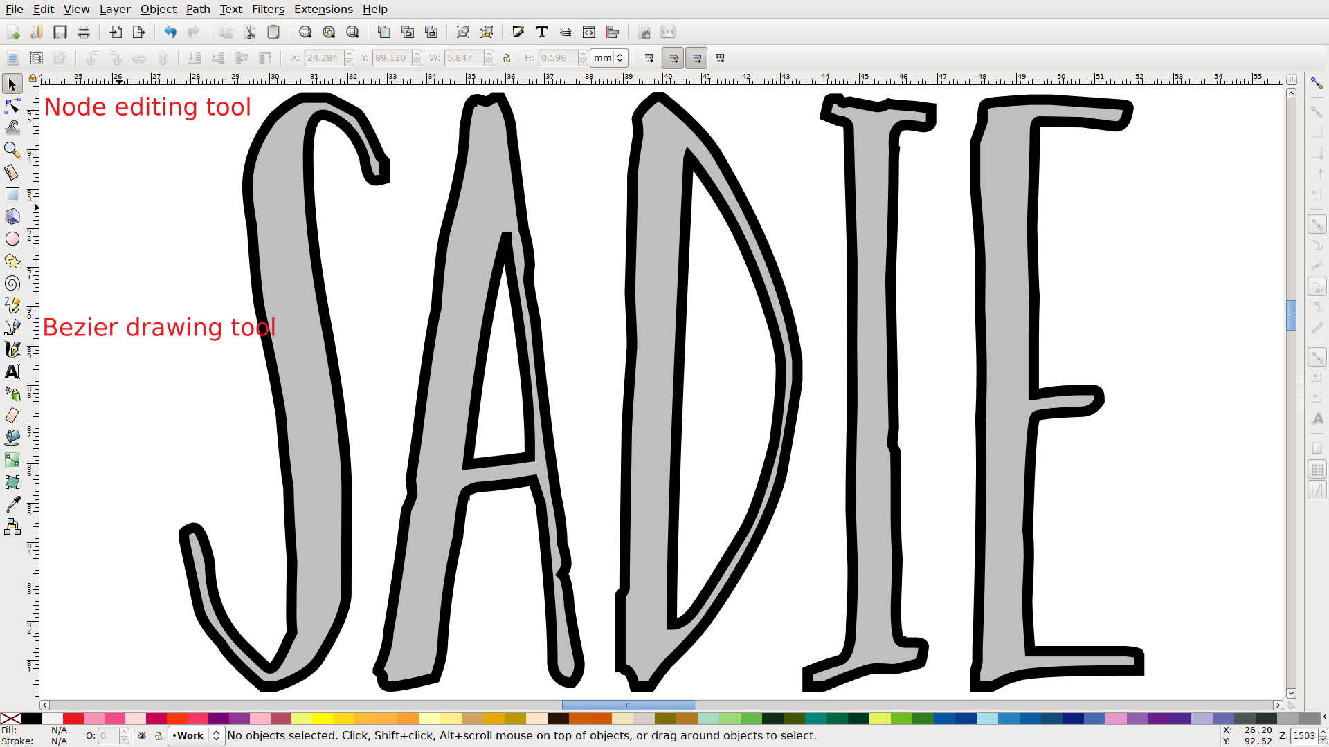
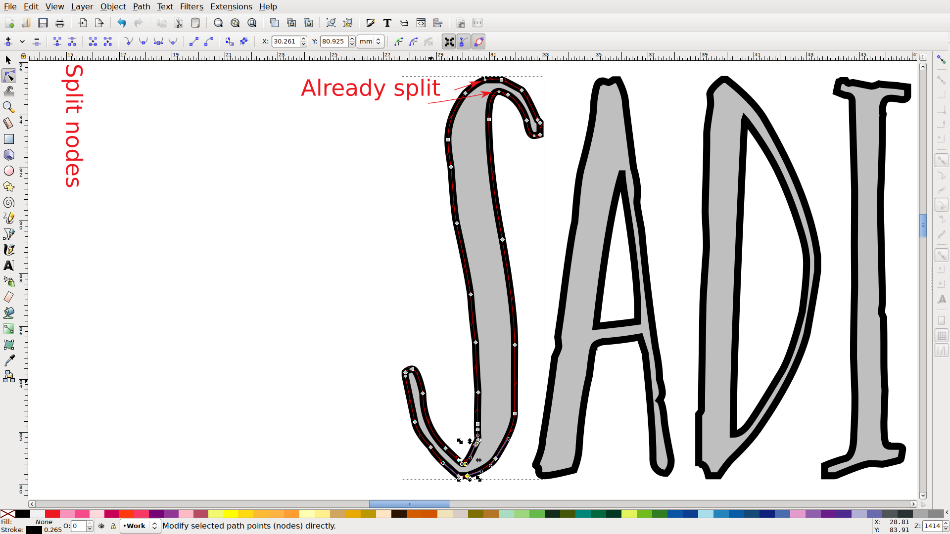
Now I have an outline. I will switch to the node editing tool, and cut out the wide part of the letter. I’ll just grab the existing nodes that are in roughly the right place and split those. Then I’ll break apart the letter (Path > Break Apart / Ctrl-Shift-K) which will give me four segments: the two end loops, and the two middle pieces. Those two will be my satin rails.
First, I’ll want to reverse one (Path > Reverse) so they go the same direction. (If your satin stitch looks like string art, this is your problem.) Next I’ll combine them (Path > Combine / Shift-K). At this point, if I have a very simple path that happens to have equal numbers of nodes in the subpath, Ink/Stitch can satin stitch it. It will try to make sure each pair of corresponding nodes are connected by a stitch, so you can use those to guide the direction of the stitching. It’s better to use rungs.
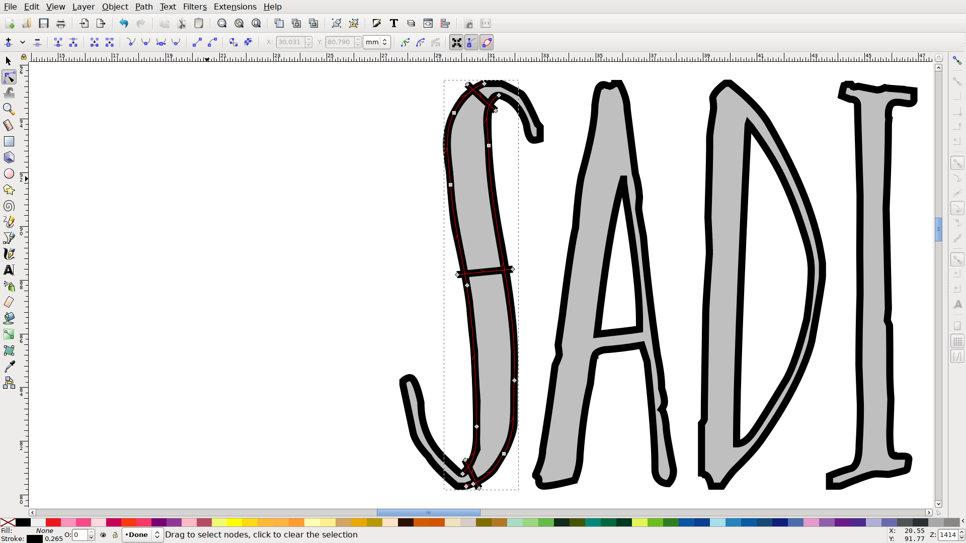
There are some tools within Ink/Stitch to do some of this automatically, but for purposes of the tutorial I’m going to keep it simple. For this stroke I’ll just give it the minimum three rungs, one at each end and one in the middle. I’ll combine those into the path (Path > Combine / Shift-K).
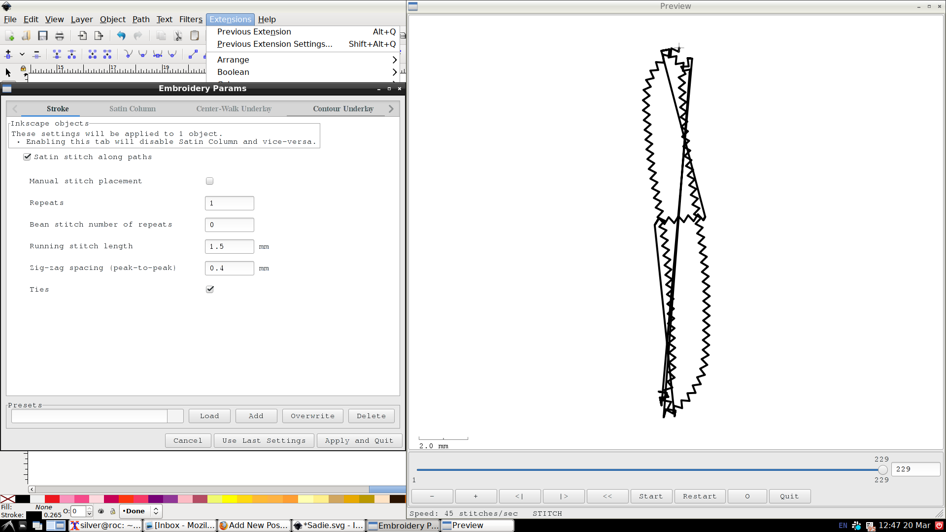
Now if I go into Ink/Stitch’s parameters, I can make them a satin stitch (Extensions > Ink/Stitch > Params). Ink/Stitch defaults to a satin stitch for non-dotted lines, but it will try to make it the width of the stroke. That’s the “Satin stitch along paths” checkbox, and it’ll result in a hilarious network of zigzags at first. If I uncheck that, it will try to interpret rungs-and-rails. It’s pretty good about explaining what it doesn’t like if there are issues. For instance fonts usually convert with one gap in them that needs closed, but in this case that was one of the places I broke up the shape initially.
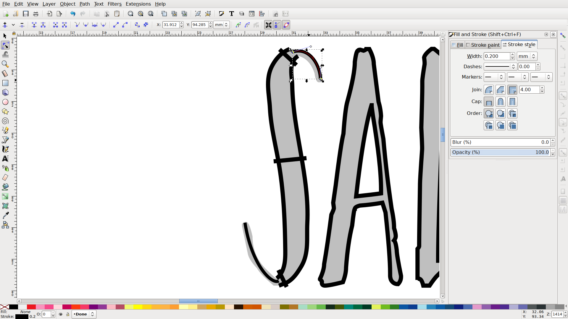
Now I’ll put in the running stitch segments. I’m just going to delete the existing stuff and use the underlying font layer to create two little curves from scratch. Rather than freehanding it (which will result in a bunch of intermediate nodes) I’ll just click a starting node, click an ending node, hit Enter to close out the line and then use the node tool to drag the curve into shape.
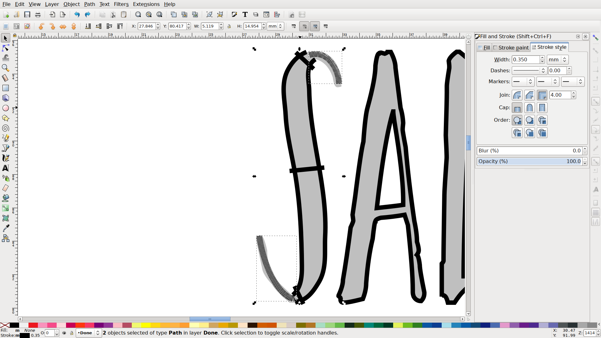
Again, Ink/Stitch is going to default to satin stitch, so I will change the stroke to a dotted one (Object > Fill and Stroke / Shift-Ctrl-F and then the Stroke Style tab). It doesn’t matter what the dot pattern is, or how wide. If I go back to the Ink/Stitch params, the preview will show me a basic running stitch.
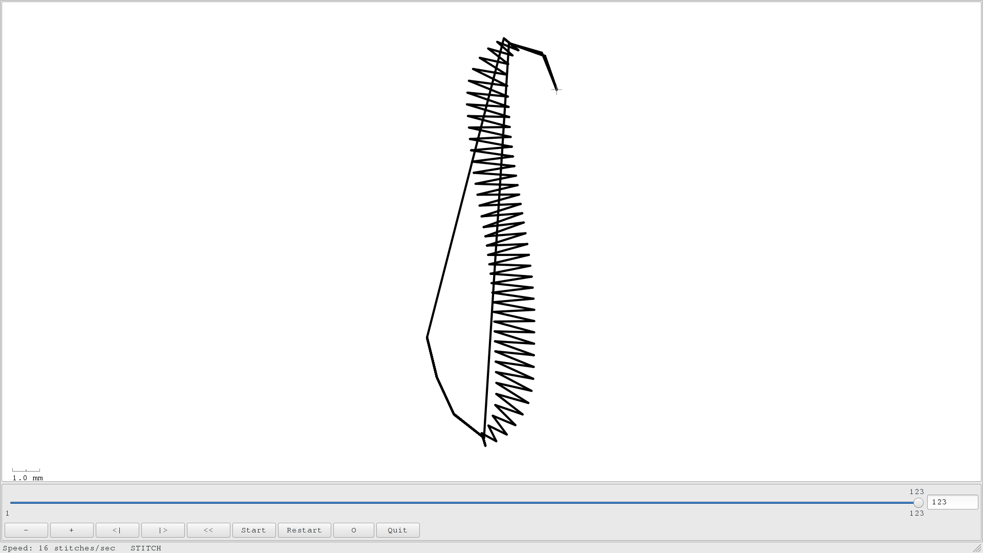
Now if I select all three objects, I can go to the simulator (Extensions > Ink/Stitch > Simulate) and see that whoops, things are not happening in the right order. There’s an Object menu to drag and drop things by name, but for something this simple I just select my first-to-sew item, and bring it to the top (Object > Raise to Top / Home). That will make it sew last, but then I’ll pick the second, bring it to the top, and so forth. Click, Home, click, Home, click, Home.
Those tails on the S look pretty feeble in the simulator, but in the realistic preview (Extensions > Ink/Stitch > Print/Realistic Preview, then check the Realistic checkbox) it will show a little more, well, realistically. They’re still a little understated though, so I’ll select them, go back to parameters, and make them a little heavier.
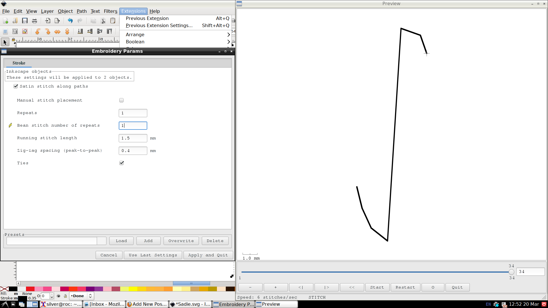
There are two ways to do that. For a stitch that doesn’t involve mixing satin I use Bean Stitch Number of Repeats: 1. Never have I ever chosen a higher repeat than 1, because a single bean stitch is forward, back, forward, so one repeat gets you three stitches instead of one. A second repeat would get you five.
Sometimes bean can be too “dotted-line”, especially in contrast to the satin, so an alternative is simply to stitch two or three running-stitch lines. This will give you about the same coverage with a slightly different look, and that’s what I’m going to do here. I’ll go with a repeat of 3 here, as heavy as a basic bean but hopefully a little smoother.
That’s it! If I had a machine that cut jump threads, I might select the last object and add a command (Extensions > Ink/Stitch > Commands > Attach Command To Selected Objects) to it: Trim Thread After Sewing This Object. My PE-800 doesn’t recognize that, and anyway sometimes it’s better to leave the jump thread to avoid thread nests and whatnot.
I’ll select all the bits of the letter and group them (Object > Group / Ctrl-G) just to make sure I don’t accidentally drop something into the middle of its stitch order later, and move on to the other letters.
The A looks pretty simple – another one satin object, two running-stitch objects letter, right? But I don’t want to trim jump threads within letters if I can help it, so I need to think about my stitching order. And also where I’m going to be coming from out of that S. I think I’ll jump down to the crossbar first. A 2-repeat running stitch will start and end at the edge of the satin. Then I’ll put in a non-repeating running stitch to reposition at the bottom of the satin and go up and over.
The D is simple. The I has a little trick: to get both of those serifs without a jump thread, I start in the middle and do a 2-repeat (out and back) running stitch each direction. The E has another trick. I could do like the A and come in on the middle crossbar, but instead I come in on the bottom one, do half the satin stitch, zip over and back to do the middle crossbar, then picked up again. If I do it right, flipping the satin rails (Extensions > Ink/Stitch > Satin Tools > Flip Satin Rails) as necessary to make sure it ends and re-starts on the right side of the columns, there’s no visible break in the satin.
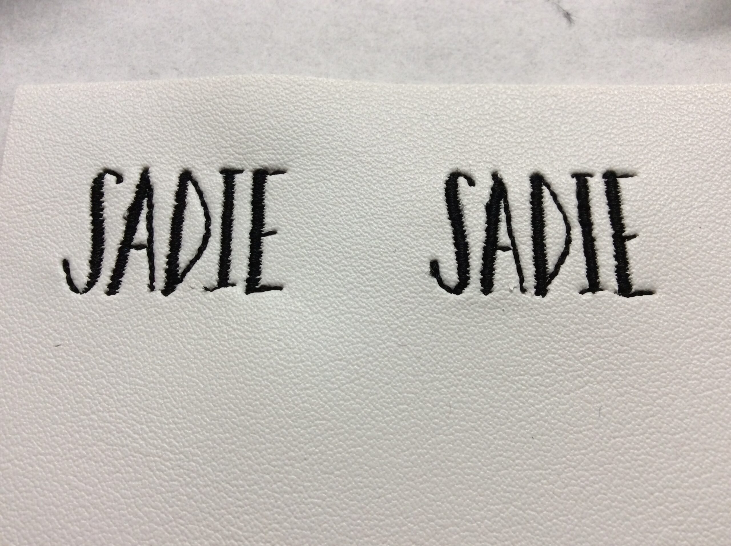
Time for a trial stitch! (Extensions > Ink/Stitch > Embroider) I put a stitched box around it to keep everything placed consistently in the hoop in case I make multiple generations. I’ll revert the stitching (Edit > Undo / Ctrl-Z) and make a quick save before I unmount the USB stick and take it over to the machine.
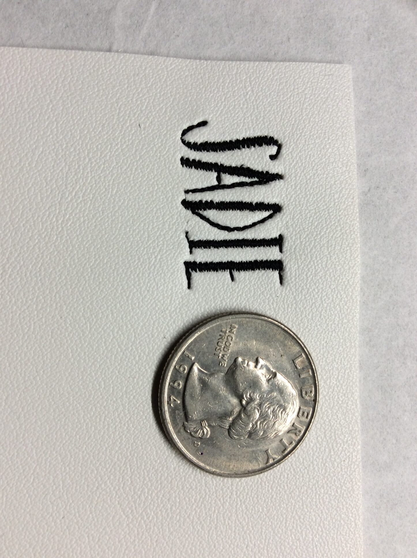
Not bad! I missed the repeat on the lower serif of the I, but everything else seems okay. On most vinyls this would be fine – I deliberately picked my worst-case squishy white. There are some options that will make those satins even nicer, so I’ll select all the satin objects (Ctrl left-click will choose a single object without needing to ungroup, then holding down ctrl-shift while clicking more will let me add the rest).
In the parameters, there are three different underlay options. They can be combined, and this is a tiny little thing so it doesn’t add that much to the stitch count. All of the underlays are there-and-back so they won’t change the start or stop points of the satin columns.
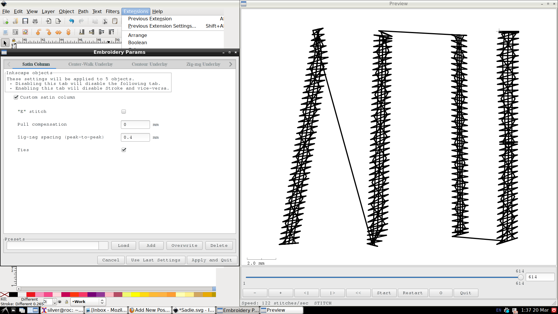
There’s also pull compensation, which will make each satin column just a little wider to allow for thread tension making them shrink (either by cutting through the vinyl’s surface or by pulling the entire fabric a little tighter), but I’m not going to turn that on just yet. Satin density is also something you can change (zig-zag spacing), which if I were using a finer-than-usual needle and thread I might consider but not for this – too much density and I’ll just end up cutting slices in my vinyl.
I think that’ll do it! The underlays are probably a little bit of overkill – probably just the contour would be adequate.
Upshot: it’s a little bit of work (less once you’re used to it, I promise) and if you have a font creator you trust and you expect to regularly use a particular font, it’s totally worth buying from them. They’ll be charging a little more than the “automatically generated, never actually tested or fine-tuned” types but, well, you get what you pay for.