Mochi color reference

In the course of organizing the work room, I uncovered my Shannon reference card and decided to build an equivalent for mochi (JoAnn’s “Pure Plush“) and compare the two fabrics color-wise. I don’t have a complete set yet, though now I have everything my local stores have had and a couple of others besides.
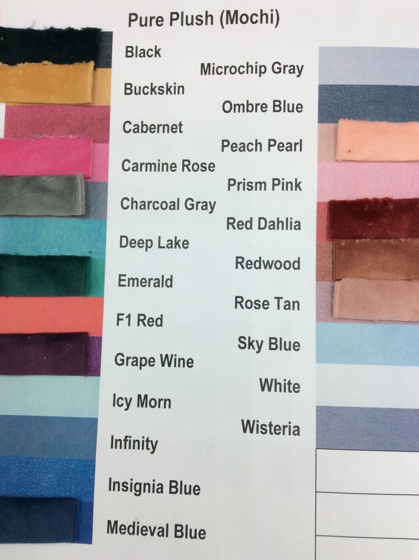
There are twenty-three solid colors listed on the website; I have eleven of them. Black and white are, well, black and white, so those match fairly obviously. Going by the foiled versions, the white is a true white.
Pictures of each follow. There’s never an absolutely perfect match, because mochi has a short-pile velvet-type texture that will be much lighter viewed from “above” the nap, much darker from “below” it. Minky has some of that, but because it’s so much shaggier it tends to mix light and dark regardless of angle.
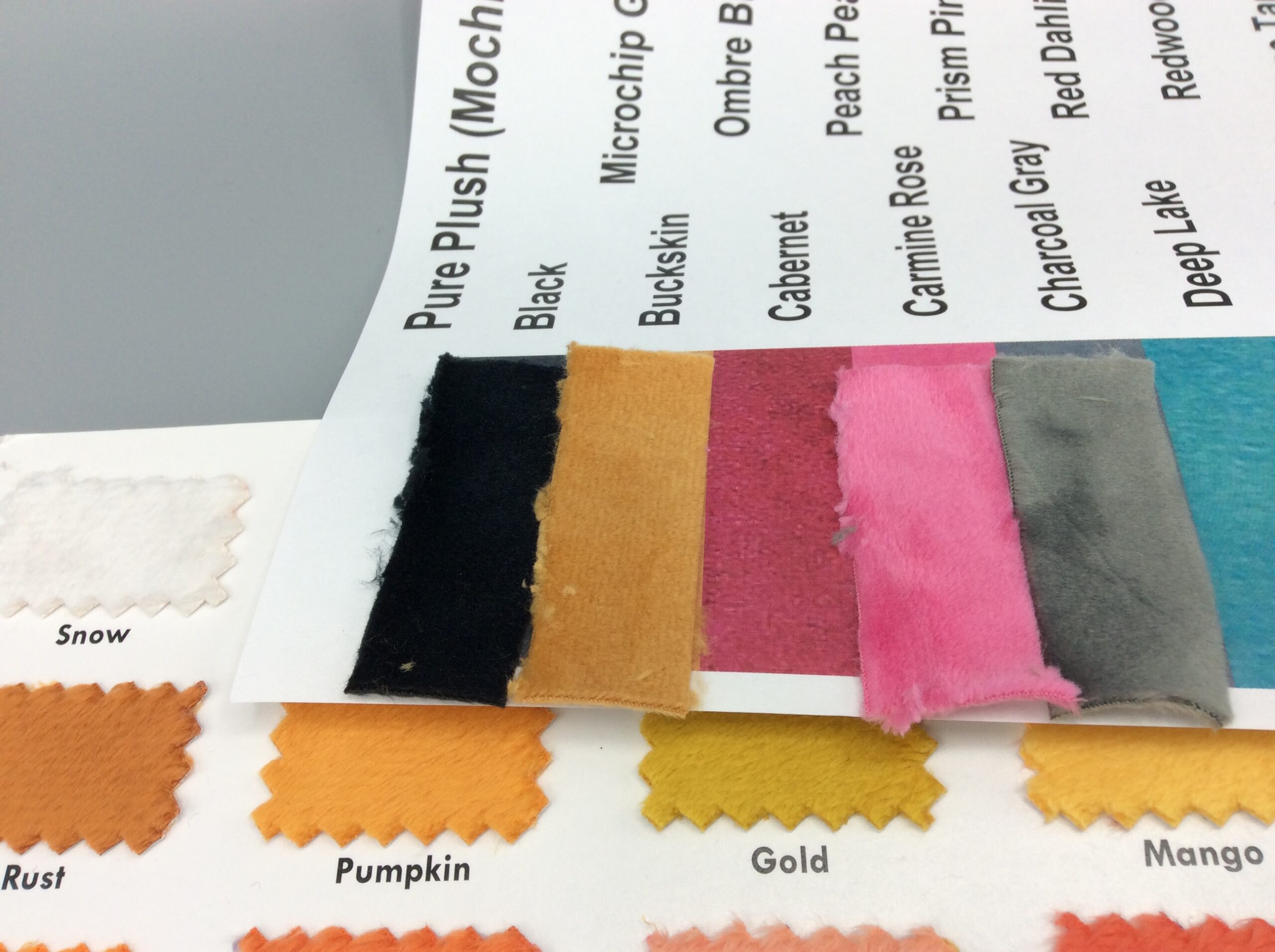
Buckskin falls between Pumpkin and Gold.
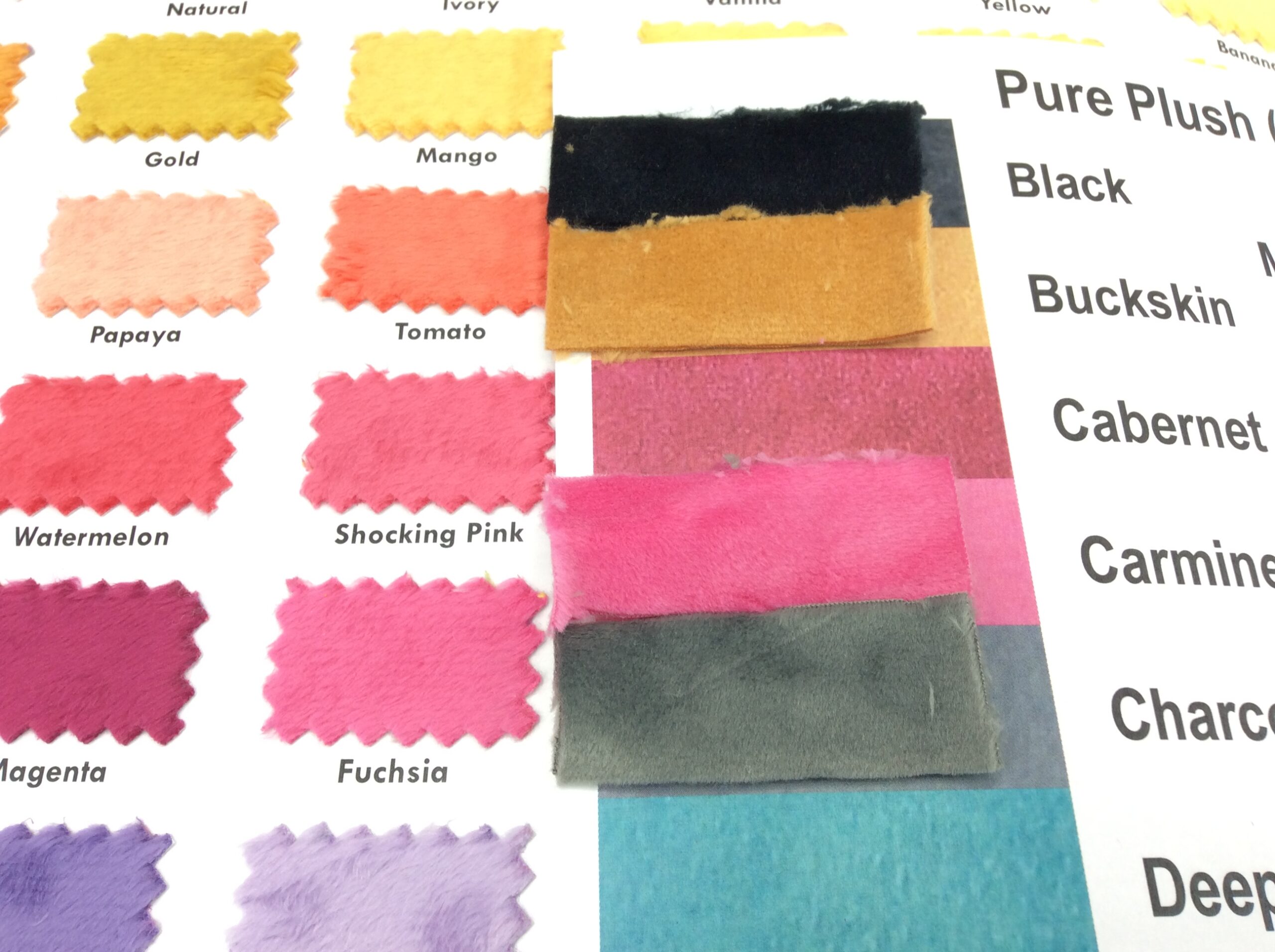
Carmine Rose is an almost exact match for Fuchsia.
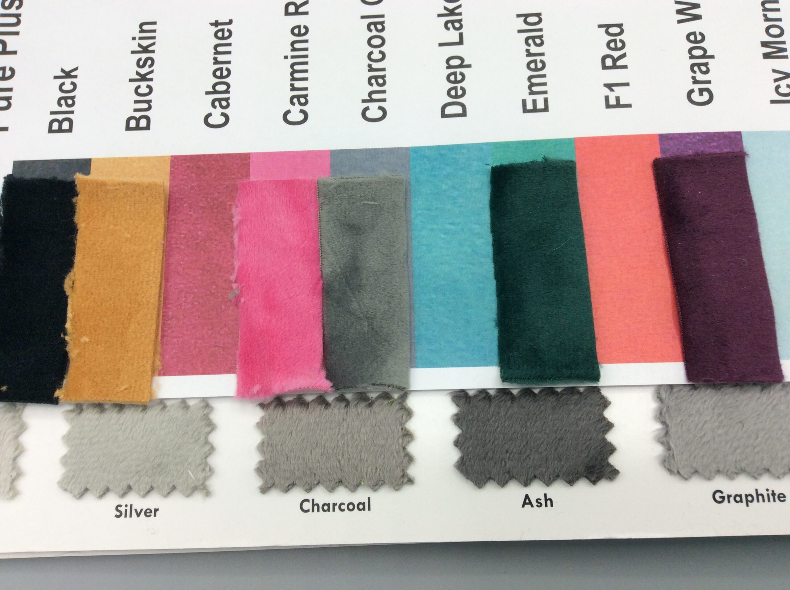
Charcoal is, well, Charcoal. It’s one of the most obvious cases where the mochi’s lightness varies more than the minky’s.
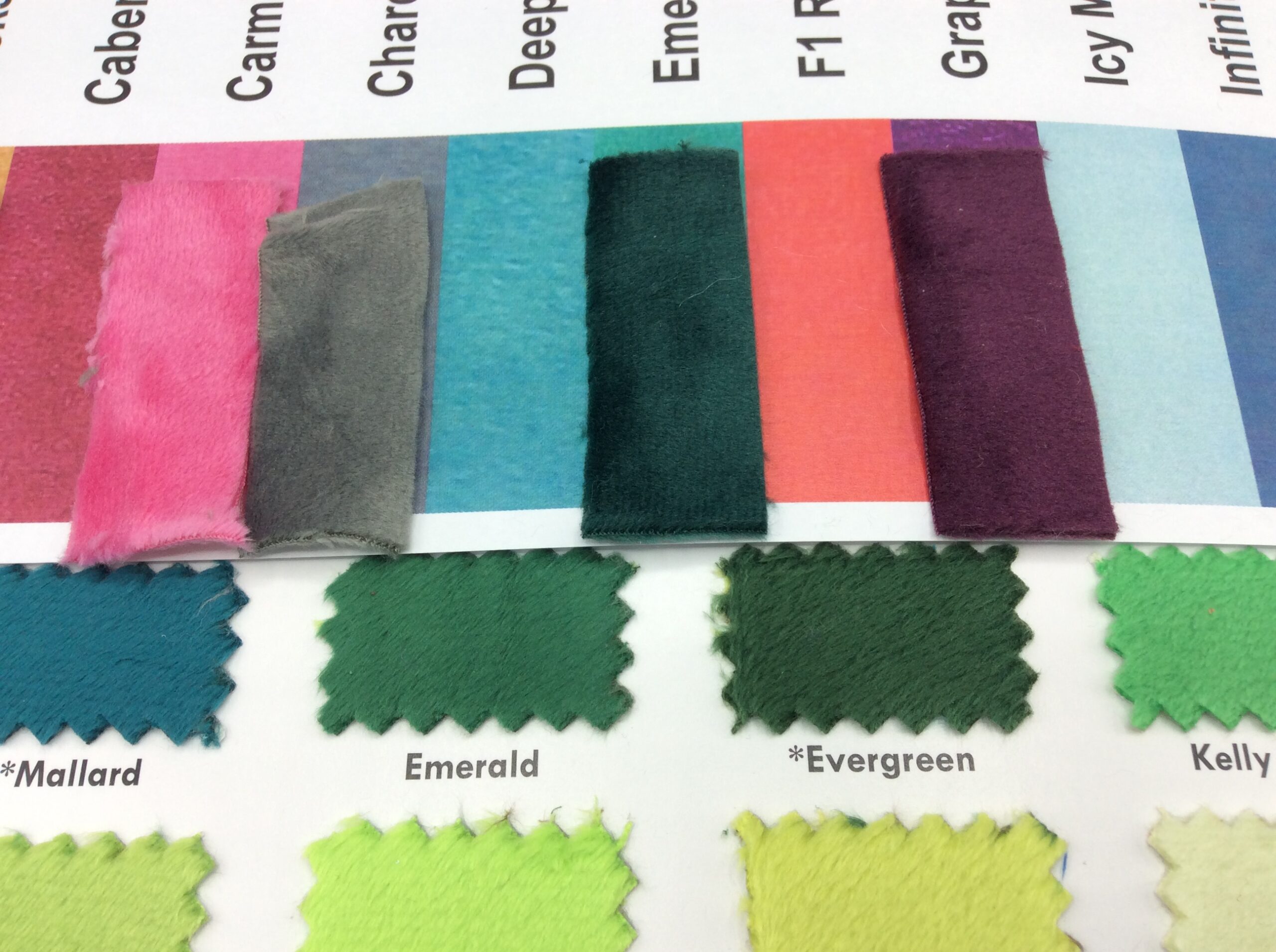
Emerald mochi is much darker than Emerald minky, regardless of angle, but otherwise it’s a good match. It’s also much, much darker than the website picture shows (the same is true for Grape Wine and Medieval Blue; clearly they lightened the darkest colors).
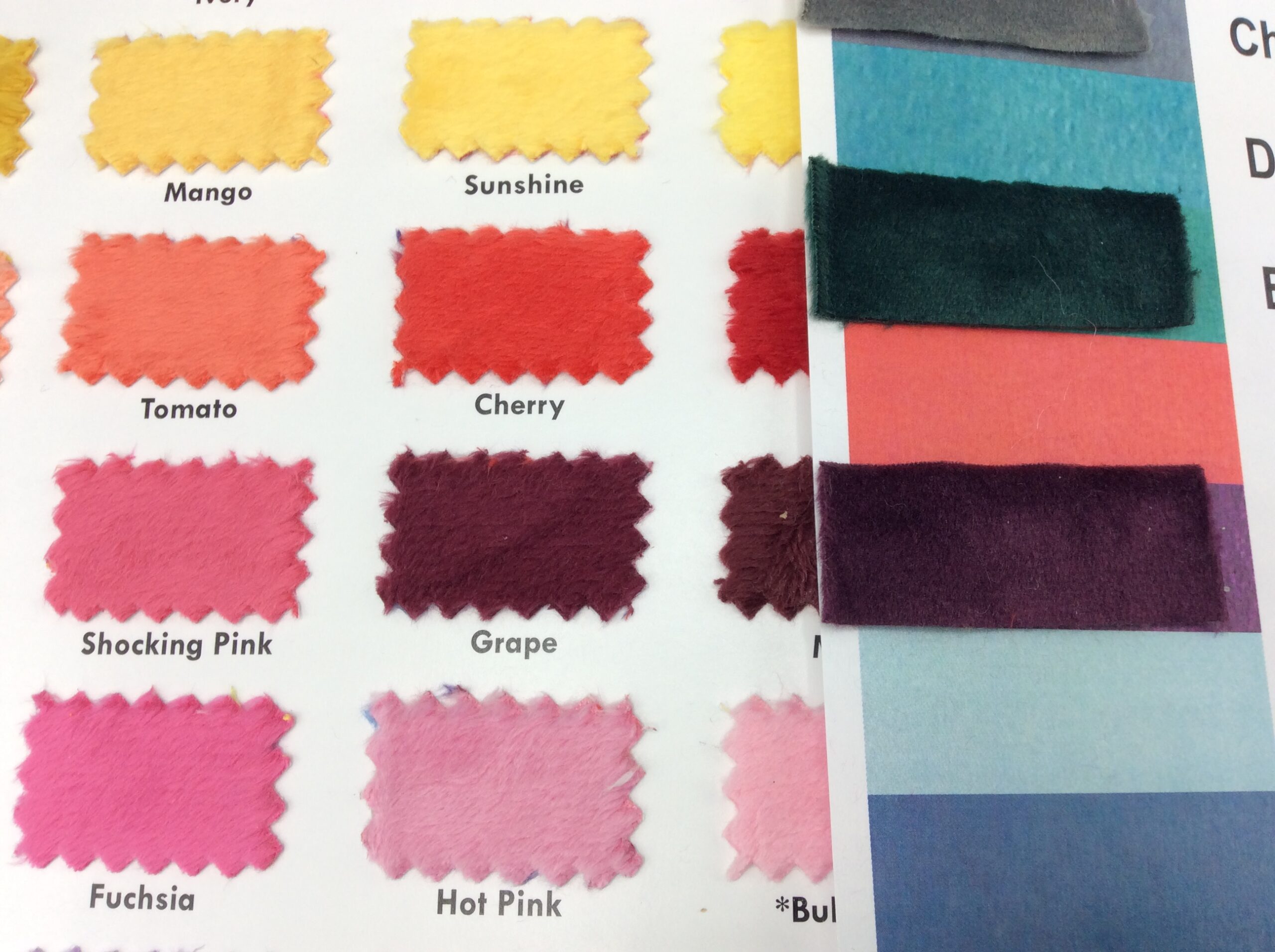
Grape Wine is slightly bluer than Merlot or Grape.
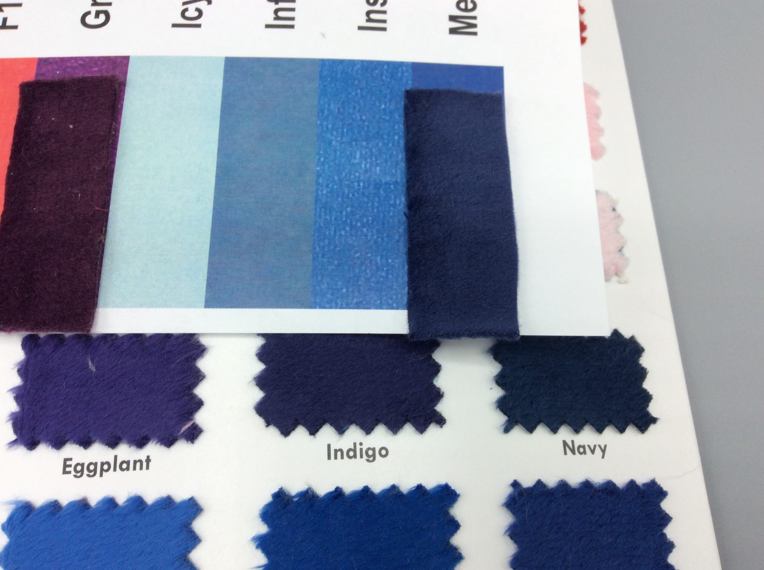
Medieval Blue is very close to Indigo, though it would also work with Navy.
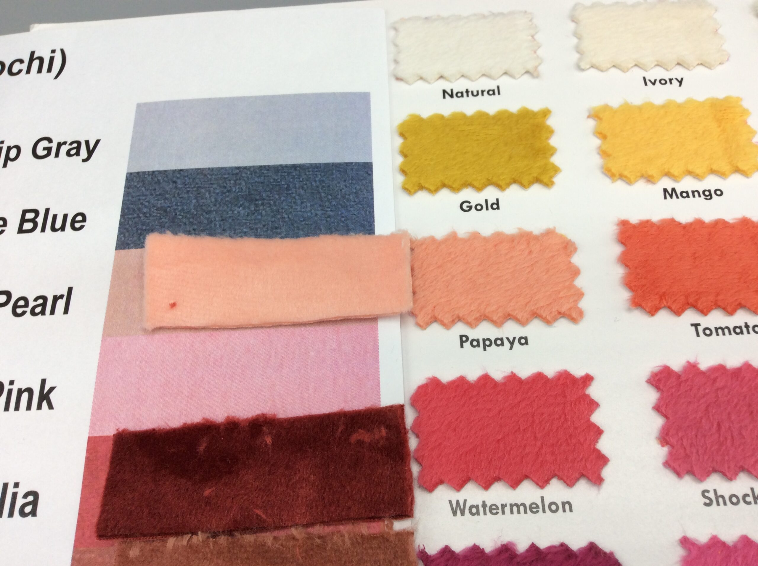
Peach Pearl is slightly lighter than Papaya.
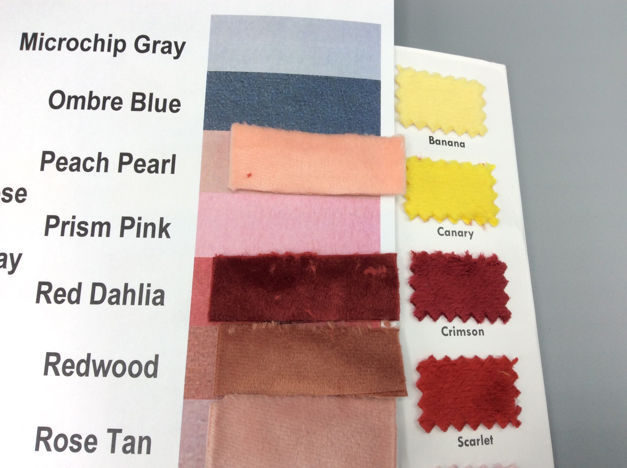
Red Dahlia is a slightly darker Crimson.
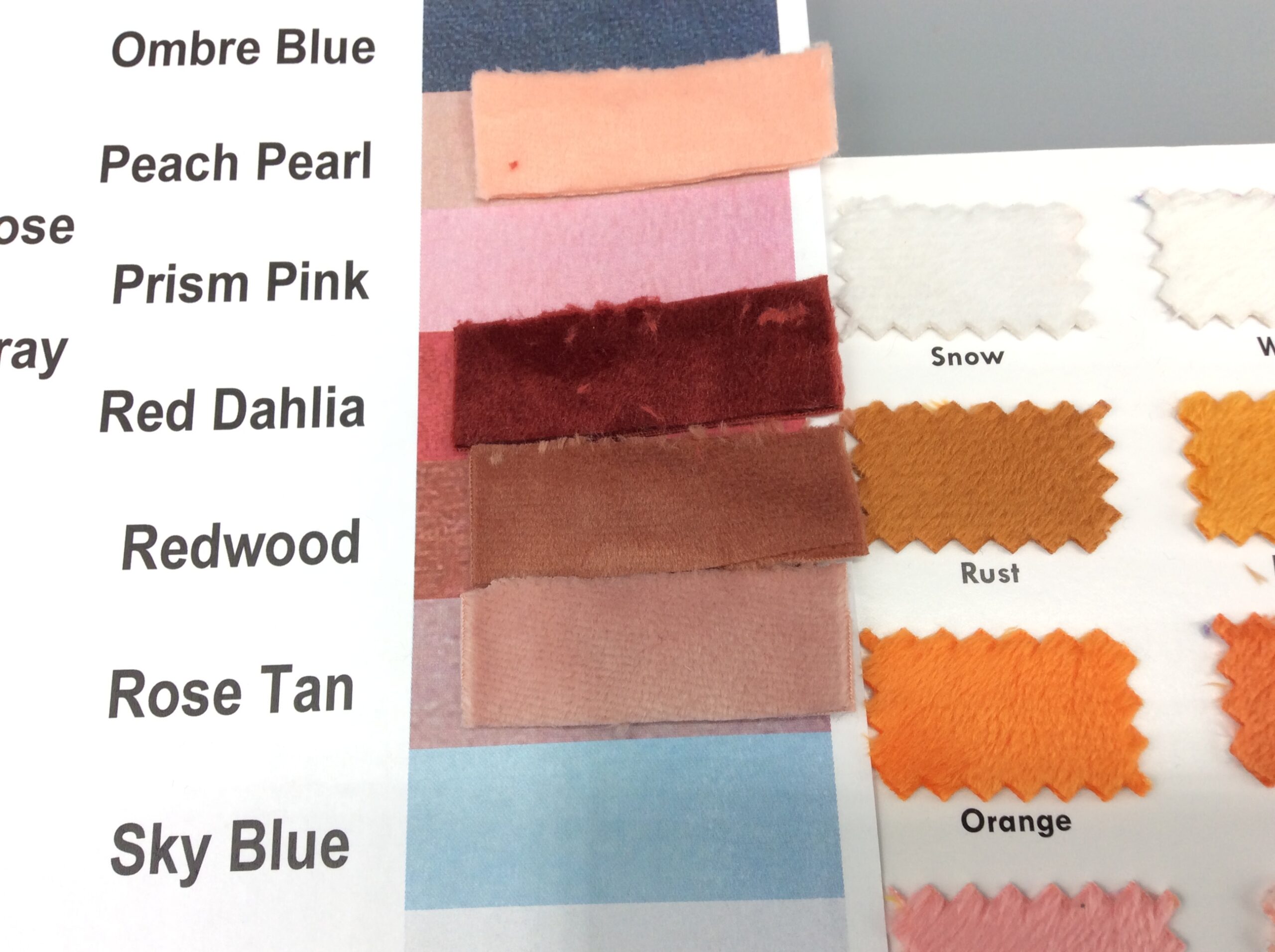
Redwood doesn’t really have a good match at all; it’s less red than Rust which is probably its closest. I wouldn’t use them together.
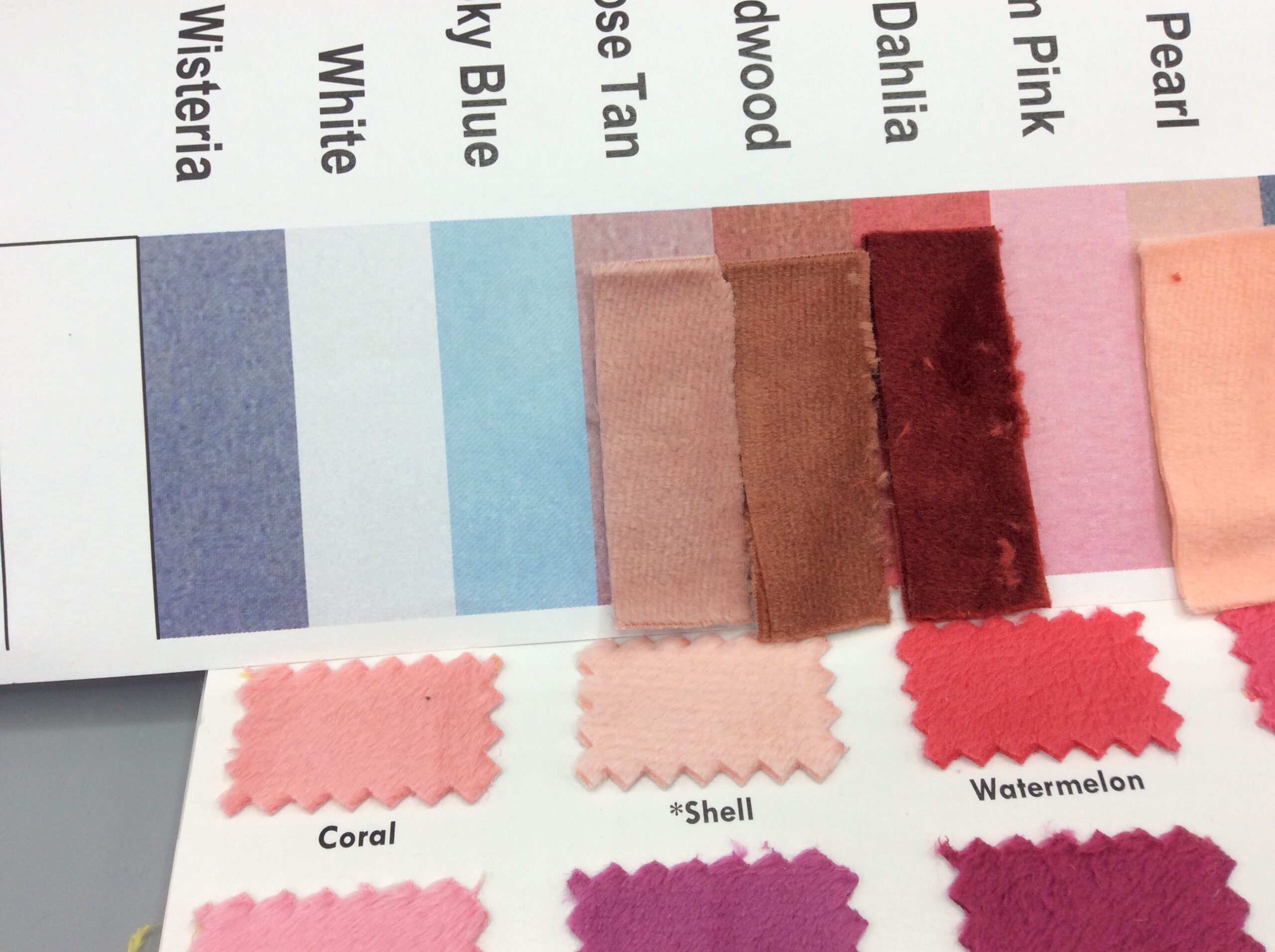
Lastly, Rose Tan is a darker match for the new Shell.
Note the much more visible surface texture on Rose Tan and some of the other colors. I don’t know if this is just something that happens now and then or if different colors just take to the trimming process better than others. It doesn’t seem tied to light or dark (buckskin doesn’t show it) and someday when we’re all back in-person in fabric stores maybe I’ll learn if certain colors always look that way.
I also have quite a few of the foiled ones, and I’ll be trying to match them up to their base colors soon.